Date: November, 22th 2016
Assignment: FP6 - Implementation Path
Project Portfolio
Project Description
- Questions that can be answered with interactions
Details about the projected visualizations can be found here.
- Animated Scatterplot
With this animated visualization, we aim to answer the question: "How does crop yield change over time with respect to daytime and night time temperature? Does precipitation factor into the relationship at all?". The two main controls interactions the user can have with this scatterplot are "clicking" and "hovering". The "clicking" addresses the user's ability to control the animation of points on the plot, such as play, pause, reset, increase/decrease the speed, or rewind. This will make the animation more user-focused and the user can investigate the answer they are looking for more deeply.
The second type of interaction is "hovering" over a certain country (dot) for a tooltip that display more detailed information about that country. This tooptil will be extremely helpful for the users if they would like to look at peculiar cases that do not fit their expections (e.g dessertification).
- Geomap
This visualization helps to illustrate the spatial aspect of the data. The question we are trying to answer is: "How did a country's crop yield change in relationship with other countries accross the globe? How does that relationship change over time? " The two main interactions we have with the map is "click-and-drag" for the slider and hovering on each country. The slider helps the user see the over-time effect, as the map will be updated in real-time with the slider's value change. On the other hand, when the user hovers over a country, detailed information about that country's crop yields will appear in a tooltip. This is helpful if the user is particularly interested in a single country, and would like to see how it changes over time.
- Line Graph (if time permits)
With this visualization, we aim to answer the question: "In the aggregate, for the period over which we have data, how did countries globally change their share of different crop types?" As mentioned in the "brainstorm" document, the two main interactions that we will enable in this visualization is hovering-clicking. Since there are transparent lines behind the actual line graph, when the user hovers over any of the line, the line will become opaque to indicate current hovering status. When the user clicks on the line, it will open a tool-tip that shows information corresponding to the year. The tooltip will display to the right of the line chart and the crop type names; the tooltip will show the actual crop share for the year, its change from the previous year to the current year, and its change with respect to the base year. This tooltip will remain until the user clicks another line to change the year they want to look at. So the biggest question that this interaction can answer is: "What happened to a crop mix at a particular year? How did it change compared to base year (1975) and the year before it?"
- Animated Scatterplot
- Initial Interface
We have sketched the initial interface as follow:

Note that this is what should appear on the screen. Since we have multiple visualizations, the user will have to scroll down to see the other visualizations. Each visualization will fit perfectly into a typical small screen, so one visualization will not be cut-off.
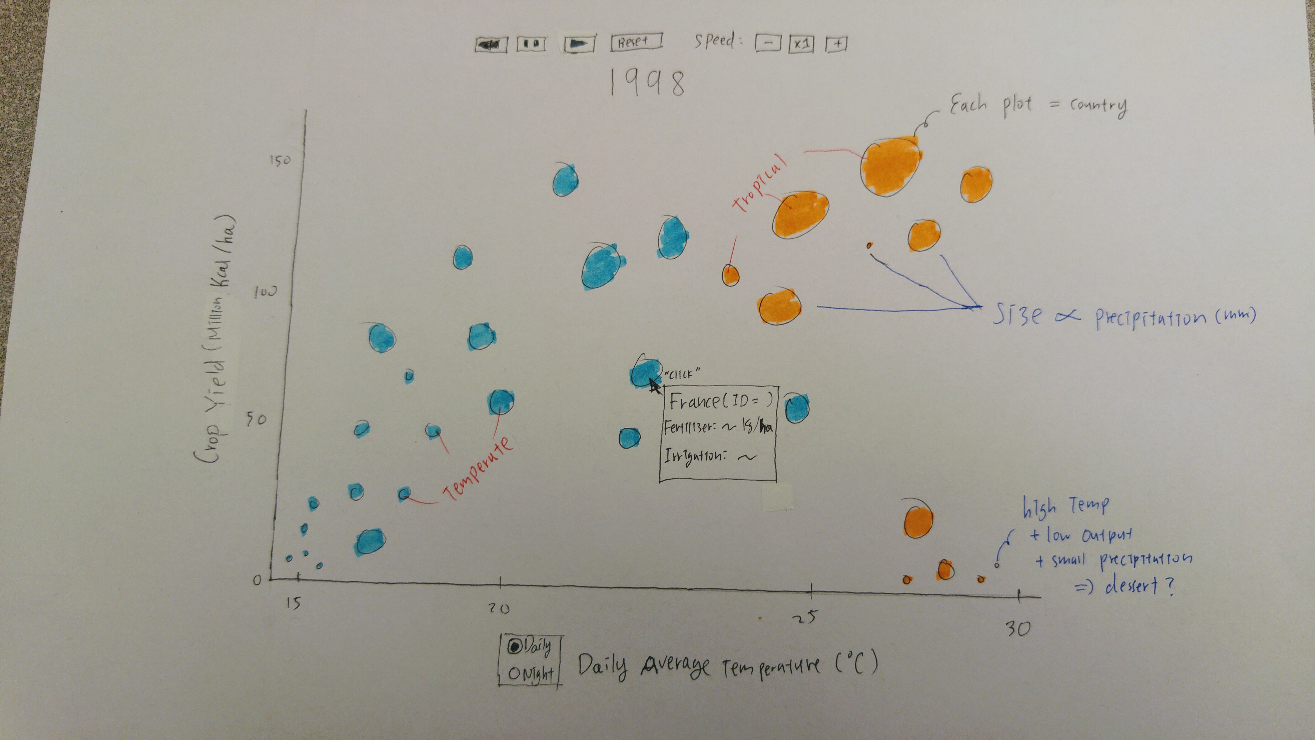
With this scatter plot, there are two main types of interactions that the user can have: hovering and clicking. When the user hovers over a specific dot - i.e a country, a tooltip will pop up next to the dot with detailed information about that specific country, including the country's name, its fertilization level and average precipitation in the corresponding year. The tooltip disappears when the mouse moves out of the dot. Regarding clicking, the buttons above the plot will allow the user to control the animation. The user can click the "play", "pause", "reset", "rewind" (if possible) to trigger its respective functionality. The user can also control the speed of the animation (default is 1 year per second). Below the chart, there are two radio buttons among which the user can click to change the type of temperature they want to look at (nighttime or daytime).
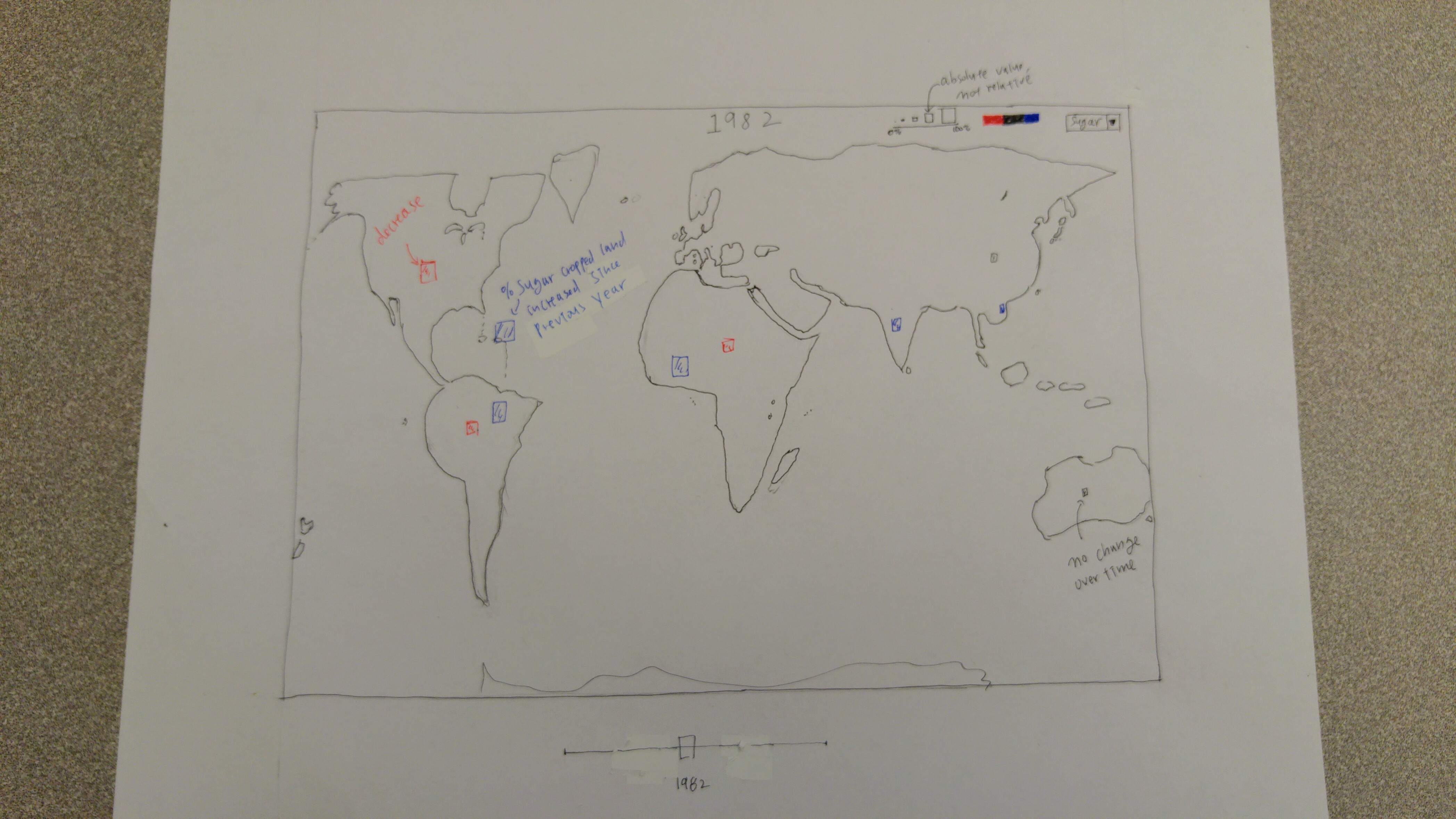
For the geomap, the user can interact in three different ways: click-and-drag (slider), hovering (over a country) and click-and-zoom (on a country). The slider is placed underneath the map, and by dragging the slider handle, the user can choose the year that they would like the map to display (crop yield per ha). The update will be in real time (hopefully) as the user changes the slider's value. When the user hovers over a specific country, a tooltip will appear with detailed information about that country's yield in the respective year. Lastly, if the user click on a country, the map will zoom in and center the country, so user can explore further that country and its neighbor.
- Expected Implementation Path
The following timeline is not definitive, but more of a general implementation path that we would like to follow, with some flexibility. We understand that there is a possibility of procrastination and unwanted over-commitments. Therefore, we did our best to take into consideration all those situations, and have come up with the following plan:
Date Son Do James Week 12 Tuesday, November 15 - Set up initial layout, create skeletons for documents (FP1 & FP2).
- Meet with collaborator to discuss about his goals and desires regarding the data.
- Work with team to write project descriptions.- Meet with collaborator to discuss about his goals and desires regarding the data.
- Work with team to write project descriptions.- Meet with collaborator to discuss about his goals and desires regarding the data.
- Work with team to write project descriptions.Thursday, November 17 - Set up initial layout, create skeletons for documents (FP3, FP4 & FP5).
- Finalize questions and interactions brainstorming with team.
- Work with team to write project goals and project report.
- Obtain UNFAO data.
- Finalize questions and interactions brainstorming with team.
- Work with team to write project goals and project report.
- Finalize questions and interactions brainstorming with team.
- Work with team to write project goals and project report.
Week 13 Tuesday, November 22 - Read in and transform data so that there is a mapping between country's ID and country's name.
- Set up data structure needed to store the data
- Collect geomap data, and investigate how to draw a geomap with D3.
- Set the layout of the map.- Study Murray's tutorial on how to draw a geomap with D3 (chapter 12).
- Write visualization descriptions and interactions in the main visualization file.Thursday, November 24 - Eat turkey!
- Start building a static scatter plot for base year 1975.
- Help out with other layouts.- Eat duck!
- Finalize the layout of the map.
- Start working on static shading for base year 1975. Ensure visibility.
- Eat ham!
- Set up slider, place it under the map.
- If possible, link the slider's functionality with geomap.Week 14 Tuesday, November 29 - Finish last week's goals.
- Start implementing animation, time-lapsed for the scatter plot. Adding buttons that can control the animations: pause, play, stop, reset, speed up, speed down, rewind (maybe).- Finish last week's goals.
- Create legend for map.
- Use the data structure to create new types of data that store percentage changes of crop types globally and regionally.
- Set up the layout for line graph. (if time permits)- Finish last week's goals.
- Make sure the map is redrawing/reshading on slider's changing.
- Start working on drop-down menu. Hook up its functionality with the map.Thursday, December 1 - Add radio button for choosing between the types of temperature (night/day).
- Make sure all pieces to work together.
- Start the initial layout for tooltips. (if time permits)- Finish the static line graph.
- Start working on interactions.
- Work on interactions (zoom-in, clicking, hovering for map).
- Finalizing geomap.Week 15
Tuesday, December 6 - Get ready for presentation!
- Fix potential bugs.
- Understand the implementation of other layouts.
- Finalizing scatterplot.- Get ready for presentation!
- Fix potential bugs.
- Understand the implementation of other layouts.
- Finalizing line graph. (if time permits)- Get ready for presentation!
- Fix potential bugs.
- Understand the implementation of other layouts.Thursday, December 8 - Finishing up project, fix bugs and clean code.
- Write project report.- Finishing up project, fix bugs and clean code.
- Write project report.- Finishing up project, fix bugs and clean code.
- Write project report.During final week, we expect to finish the project, with only minor code clean up.
- New Concepts/Skills To Learn
- We base our visualizations on Murray's D3 tutorials: Chapter 6 (Making a scatter plot) and Chapter 12 Geomapping.
- The ability to incorporate geodata into building a geomap of the world. We will also need to understand how to detect interaction with certain country, as identify which country we are currently operating on.
- The ability to search for a particular country to light it, and maybe zoom in on the map, and display detailed information about that country.
- Placing svg on top of each other by making use of opacity and transparency attributes.
- New D3 features such as drop-down menu, radio button, line graphs.
- Learning how to work with loading data into d3 from CSV and Excel files.
- Animation and learning to change animation speed during an animation.
References
-
Nelson, Erik and Bates Congdon, Clare, "Measuring the Relative Importance of DIfferent Agricultural Inputs to Global and Regional Crop Yield Growth Since 1975" (2016). Economics Department Working Paper Series. Paper 12.
http://digitalcommons.bowdoin.edu/econpapers/12
External Links
To Son's homepage
To James' homepage
To Do's homepage