Date: November, 17th 2016
Assignment: FP3 - Questions and Interactions (brainstorming)
- Initial brainstorming for potential questions
- How did crop yield change across the globe from 1975 to mid 2000s?
- How did the change in temperature (day and night averages) affect crop yield over time globally and regionally?
- What types of crop are more popular in temperate and tropical regions?
- Did regional use of fertilizer have a positive effect in amount of harvest over time? If so, how much?
- How did specific crop types change according to the change in temperature (day and night averages)?
- How did specific crop types change over time globally? Is there a shift of focus on what should be produced?
- Did investment in agricultural technology help with growth? (yield/investment)?
- What agricultural input has the strongest effect on crop yield? Does this change over time?
- Did the size of arable land change over time? If so, was it related to irrigation?
- Is soil score a good indicator of productivity/fertility of the land? We could look into crop yield, along with fertilizer use and degree of irrigation, and how they could counter bad soil score among countries.
Among these questions, there are three questions that we are particularly interested in, and would like to pursue (listed in order of importance):
- How did the change in temperature (day and night averages) affect crop yield over time globally and regionally?
- How did crop yield level of a country change as related to global crop yield (million kcal/ha)? How did this relationship change over time?
- How did specific crop types change over time globally? Is there a shift of focus on what should be produced?
We will first try to implement visualizations for the first two questions; then, if time permits, we will move on to implement visualziation for the last question.
- Questions & Potential Sketches
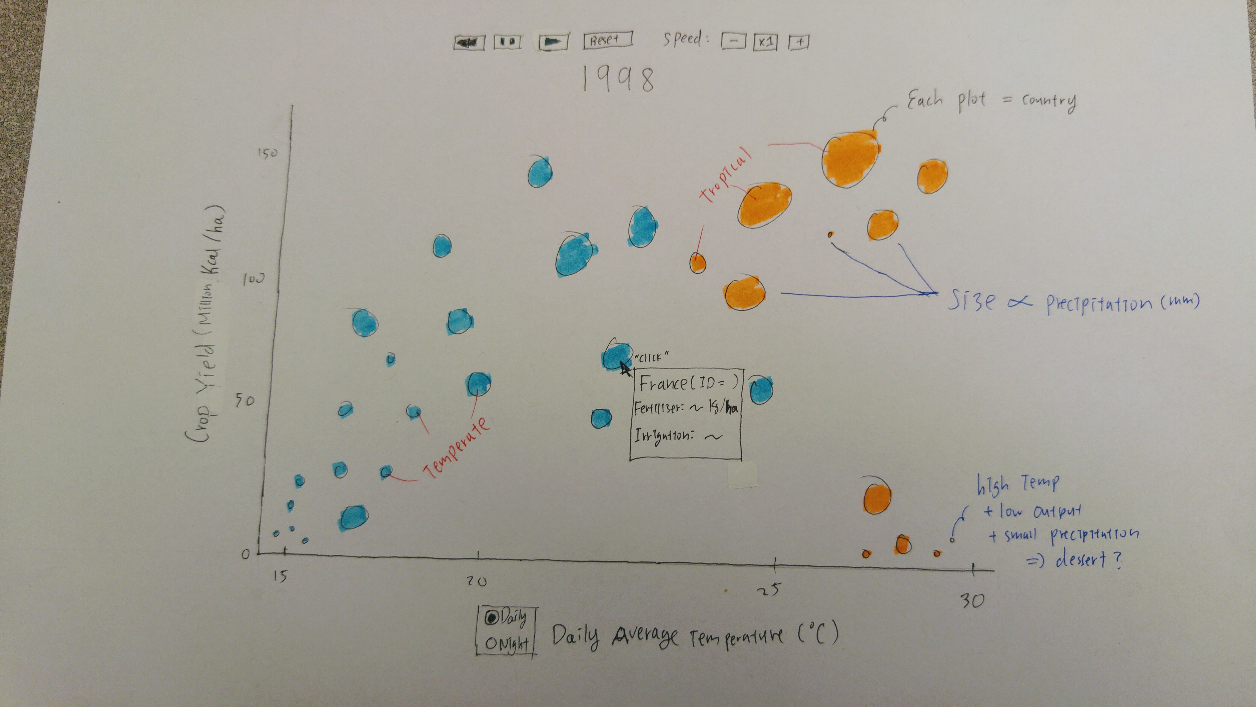
How does crop yield change over time with respect to daytime and night time temperature? Does precipitation factor into the relationship at all?
In this visualization, we will show a scatterplot that gives the relationship between temperature and crop yield in million kCal/hectare over time for each country. On the y-axis, we will give crop yield in million kCal/hectare, and on the x-axis we will give temperature in either daily or night time average temperature; the user has the option of selecting the temperature they want to use via radio button. Other features of the visualization include the color of the scatterplot buble, which corresponds to whether the country is temperate or tropical. Furthermore, the size of the bubble will scale with precipitation in that country, measured in mm. The usefulness of precipitation as an attribute is that it will allow the user to see desertification, which is a question our collaborator was interested in. Furthermore, we will be showing all of these features "over time" via animation. There will be a start, pause, reset, slow down, and speed up button at the top of the visualization which will allow the user to see how the yields and precipitation have changed as temperatures have changed over time. The visualization will cycle through all the years for which we have data and will update each country's bubble via animation. The user can use the start, pause, reset, slow down, and speed up buttons so that they can view the visualization and values in a speed that make sense for them, and so they may pause to look more carefully if they so desire. Finally, there is a tooltip for each country that will display on hover and will show the country name, the exact values for its yield and temperature for the given year, and also the fertilizer usage in kg/hectare and irrigation level (measured by fraction of cropped lands equipped for irrigation).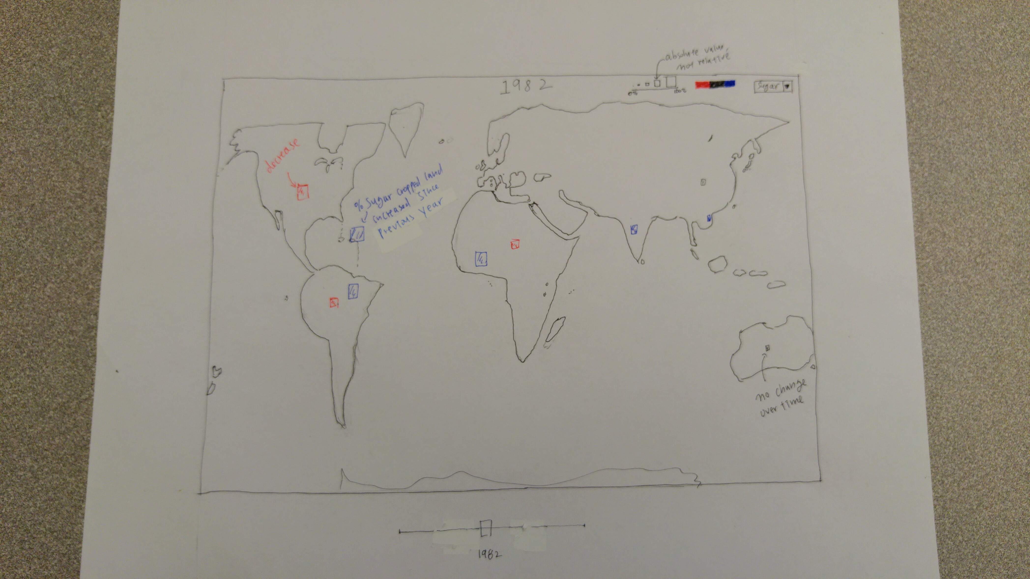
How did a country's crop yield change in relationship with other countries accross the globe? How does that relationship change over time?
The last visualization we wanted to make is a geomap graph that shows how a country's yield compares to other countries across the globe, and how that relationship change overtime. The most important feature of this map is the shading of each country will be based on a gradient level, which will represent how it is related to the global crop yield range. There will be a slider at the bottom, with which the user can slide to see the relationship in a particular year. The starting point of the slider will be year 1975, and the ending point will be 2007 (excluding fertilizer data). The user can also hover over a country to see a tooltip with more details regarding its crop yield, and potentially its agricultural inputs information.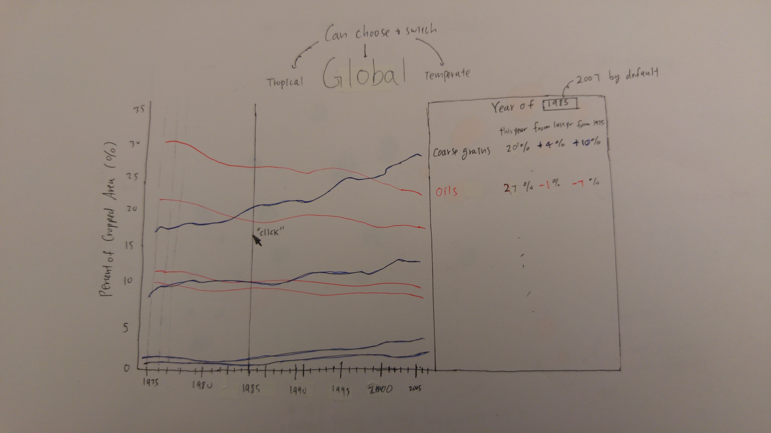
In the aggregate, for the period over which we have data, how did countries globally change their share of different crop types?
This image shows the aggregate crop share for all countries in the data, over all the years for the data, for each of the eight crop types in a line graph. With average percentage cropped area on the y-axis, and time on the x-axis, a user will be able to see how crop shares have changed in the last ~30 years. At the end of each crop's line graph, we will display the name of the crop type. For each year in the data, we will show a transparent line on the line graph that, when hovered, becomes more opaque. When the user clicks on the line, it will open a tool-tip that shows information corresponding to the year. The tooltip will display to the right of the line chart and the crop type names; the tooltip will show the actual crop share for the year, its change from the previous year to the current year, and its change with respect to the base year. This tooltip will remain until the user clicks another line to change the year they want to look at. - New Concepts/Skills To Learn
- The ability to incorporate geodata into building a geomap of the world. We will also need to understand how to detect interaction with certain country, as identify which country we are currently operating on.
- The ability to search for a particular country to light it, and maybe zoom in on the map, and display detailed information about that country.
- Placing svg on top of each other by making use of opacity and transparency attributes.
- New D3 features such as drop-down menu, radio button, line graphs.
- Learning how to work with loading CSV data into d3 from a file.
- Working with double-ended sliding scale.
- Animation and learning to change animation speed during an animation.
References
-
Nelson, Erik and Congdon, Clare Bates "Measuring the Relative Importance of DIfferent Agricultural Inputs to Global and Regional Crop Yield Growth Since 1975" (2016). Economics Department Working Paper Series. Paper 12.
http://digitalcommons.bowdoin.edu/econpapers/12
External Links
To Son's homepage
To James' homepage
To Do's homepage