Specific Project Proposal
Do Yeun Kim and Ernesto Garcia
Due: 2200 of October 25, 2016
Project Description
The goal of this project is to create interactive visualizations for
a more complex and real - that is, not fabricated - dataset,
implementing novel interactions. The data were acquired
from UCI Machine Learning
Repository , and more specifically,
the
Computer Hardware data .
Data description
As mentioned above, the data we are using is
called "Computer
Hardware" This dataset looks into 209 models of processors that are
manufactured by 30 vendors. They look into 6 numerical attributes for each
processor (Thus, there are 8 attributes in total), which are as follows:
- MYCT: Machine Cycle Time (ns)
- MMIN: Min Main Memory (KB)
- MMAX: Max Main Memory (KB)
- CACH: Cache Memory (KB)
- CHMIN: Min Channels (units)
- CHMAX: Max Channels (units)
- PRP: Published relative Performance
- ERP: Estimated Relative Performance
Here, ERP is derived from the original article, and given that the data
description provides the
Summary Statistics wherein the PRP correlation for each attribute is
noted, we assume that the first 6 numerical attributes were used to
determine PRP, and most likely ERP as well.
Data is formatted as follows:
Brand, Model, MYCT, MMIN, MMAX, CACH, CHMIN, CHMAX, PRP, ERP
adviser,32/60,125,256,6000,256,16,128,198,199
amdahl,470v/7,29,8000,32000,32,8,32,269,253
amdahl,470v/7a,29,8000,32000,32,8,32,220,253
...
Here, we are interested in three scopes:
- Which vendors are "doing well" in regards to PRP and ERP for their models?
- Categorize models into different PRP and ERP ranges
- Map the models onto appropriate vendors
- Data being used:
- Brand, Model, PRP, ERP
- adviser,32/60,198,199
- amdahl, 470v/,2269,253
- ...
What does the correlation between the numerical attributes and PRP
or ERP look like?
- Map PRP and ERP against the 6 numerical attributes and see if
there is a correlation there. If a correlation exists, it is likely
that the 6 attributes were indeed used to determine PRP and
ERP
- Data being used:
- MYCT, MMIN, MMAX, CACH, CHMIN, CHMAX, PRP, ERP
- 32/60,125,256,6000,256,16,128,198,199
- 470v/7,29,8000,32000,32,8,32,269,253
- 29,8000,32000,32,8,32,220,253
- ...
Does ERP serve as an accurate estimate of PRP?
- Compare PRP and ERP to see if ERP is an accruate representation
of PRP
- Data being used:
- Brand, Model, MYCT, MMIN, MMAX, CACH, CHMIN, CHMAX, PRP,
ERP
- adviser,32/60,125,256,6000,256,16,128,198,199
- amdahl,470v/7,29,8000,32000,32,8,32,269,253
- amdahl,470v/7a,29,8000,32000,32,8,32,220,253
- ...
Visualizations and Interactions
We believe that we can use two interactive visualizations to answer the
three questions above.
We can answer the first question using a bipartite
visualization. Here is the example of the bipartite visualization:
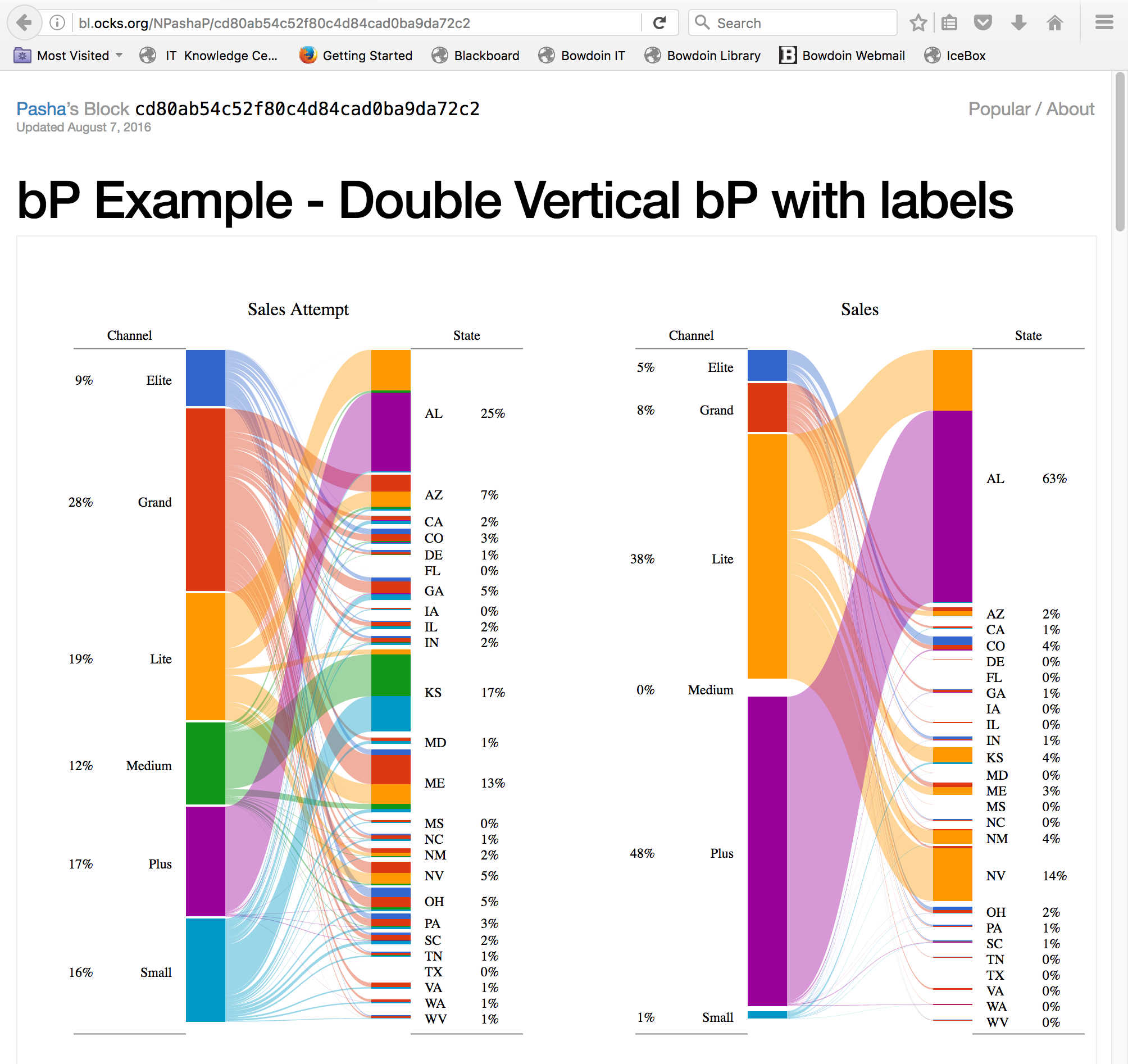
Here, we believe that The states can be replaced by vendors, and the
percentages of state incidents with the number of models. The channel
variable can be replaced by the PRP range or ERP range. The user can hover
over a specific score range or a specific model to filter out - that is,
only emphasize the bar on which the mouse is hovered - the rest of the
data. We may be able to further tweak the visualization to show specific
models, not just the vendors, when the user prompts by clicking on the
bar.
The second and third questions can be visualized using a "difference chart"
graph. Here is an example:
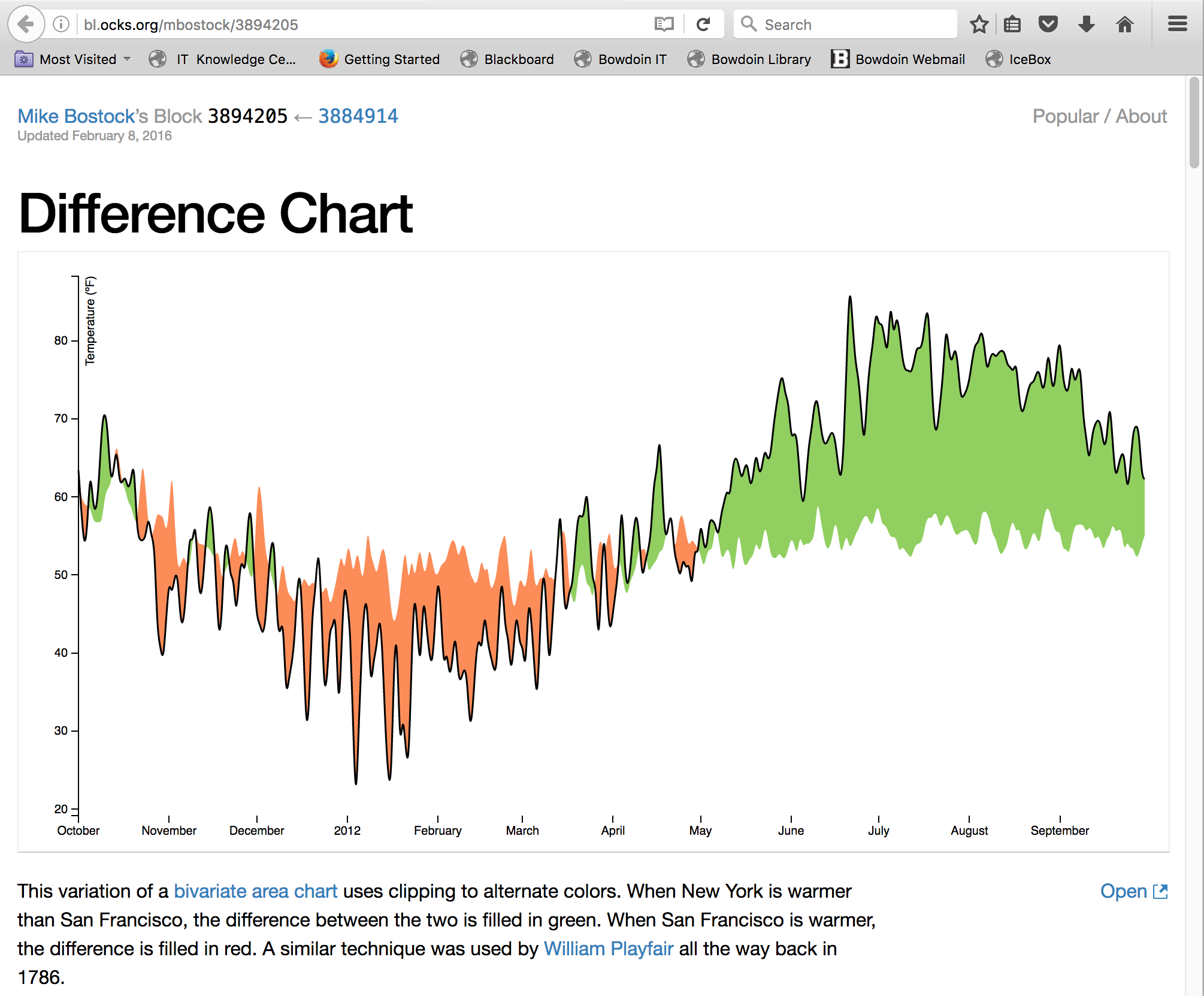
Here, we believe that we can put appropriate attribute, most likely the
numerical attributes, as the x-axis and map both PRP and ERP to those
attributes. We can see the relationship and correlation between the PRP or
ERP and these attributes. We can also observe how well ERP represents PRP
by comparing the scores themselves, by mapping both of them at once. The
main form of interaction we can think of is changing the attribute that
will fall into the x-axis. The y-values will also change as the numerical
attributes are not necessarily bound to the models. We may be able to make
the visualization further informative by showing the difference b/w PRP
and ERP, which would find the corresponding PRP given an ERP point, and
vise versa, and give us the disparity between the two.
d3 Concepts
The new concept that we will be looking into would be drop-down menu and
that will allow the user to choose which attribute he/she wants to look
into. The drop-down menu wil be used for the "difference chart," where
the user can dictate the x-axis variable to see different
correlations. As for the bipartite visualization, we will be furthering
our understanding of transitions.
Implementation Path
For both visualizations, we hope to use the example code as the skeleton
of the project. We will be tweaking the code - most of which is provided
as in .js link - to fit the dataset we have and the visualization of our
preferance. As for the bipartite visualization, the main changes applied
will be the categorizing, to fit the data format. As for the difference
chart, we will first get a firm and complete graph using one attribute,
then attempt to implement the drop-down menu to allow the user to change
the attribute being used for the x-axis. Once we know how to change the
attribute being plugged into the graph, we can make the graph transition
to be re-drawn given the new attribute.
- Figure out how to read in the data, in desired format
- Tweak the existing code for both visualization to fit our data
into the visualization
- Work on drop-down menus and further interactivities mentioned
above
Back to Project
Back to the Main Page